Boycat just got a major visual upgrade across the app. This is our last big UI-focused update for a bit, because the next phase is about making Boycat faster, smoother, and more reliable end to end.
Here’s what changed, and what to try first.
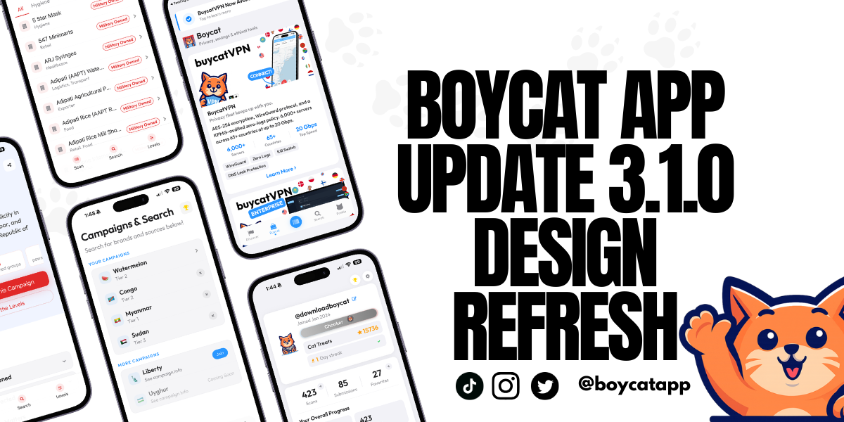
What’s happening
We shipped a full design refresh across Boycat, including sign-in, navigation, campaigns, discover, teams, and profile.
The goal is simple: make the app feel clearer, calmer, and easier to use, especially if you’re new.
What we know (what’s included in this release)
A new first impression
Sign in and onboarding screens now have a more modern look and a cleaner flow. You’ll notice a softer, more polished aesthetic and clearer action buttons.
A floating navigation bar
The bottom navigation now feels lighter and more “native,” with a floating glass-style look and smoother tap feedback. It’s also better behaved when your keyboard is open.
Scanner looks cleaner
The Scan tab is now more consistent with the rest of the interface, with a simpler, contained button that’s easier to recognize quickly.
Campaign pages are now full “landing pages”
This is the biggest user-facing change.
Campaigns are no longer just a brand list. Each campaign now includes:
- A clear summary of what the campaign is about
- “Quick Clarity” sections that explain the logic in plain language
- Swipeable levels that show what each tier means
- Actions you can take immediately: Scan, Search, Alternatives, Share
- Sources you can expand when you want the evidence
- A live-updates style timeline for what has changed
More campaigns, clearer structure
We expanded and structured campaign support so different campaigns can use different frameworks and still feel consistent inside the app, including newer campaigns like Privacy and Uyghur forced labor accountability.
Discover is easier to browse
Discover is now split into three clearer areas:
- Discover
- Boycat Times
- Products
Products now uses a scroll-friendly grid that’s easier to skim.
Profile, settings, and teams feel more polished
We tightened the layout and navigation across Profile and Settings, and made Teams easier to browse with clearer search and cleaner organization.
What it means
This update is about reducing friction.
If you are opening Boycat for the first time, the app should feel easier to understand and easier to move through.
If you already use Boycat, the most noticeable upgrades will be:
- Campaign pages that explain themselves better
- Navigation that feels lighter
- A more consistent design system across screens
What we're not claiming
This refresh does not change what Boycat stands for or how we score. It’s an interface upgrade.
The next phase is not about new surfaces. It’s about performance work that makes everything feel more dependable.
What you can do
Take the 30-second tour
- Update the app.
- Open any campaign and scroll through:
- Quick Clarity
- Levels
- Sources
- Tap Discover → Products to see the new layout.
- Try the floating tab bar and scanner.
Tell us what feels better (or worse)
If something feels confusing, slower, or harder to find, that feedback is most useful right now. This is exactly the moment where small notes lead to big quality improvements.